
- Pitangoux is now Triolla –
We’ve rebranded! Hello and welcome!


 Book a Call


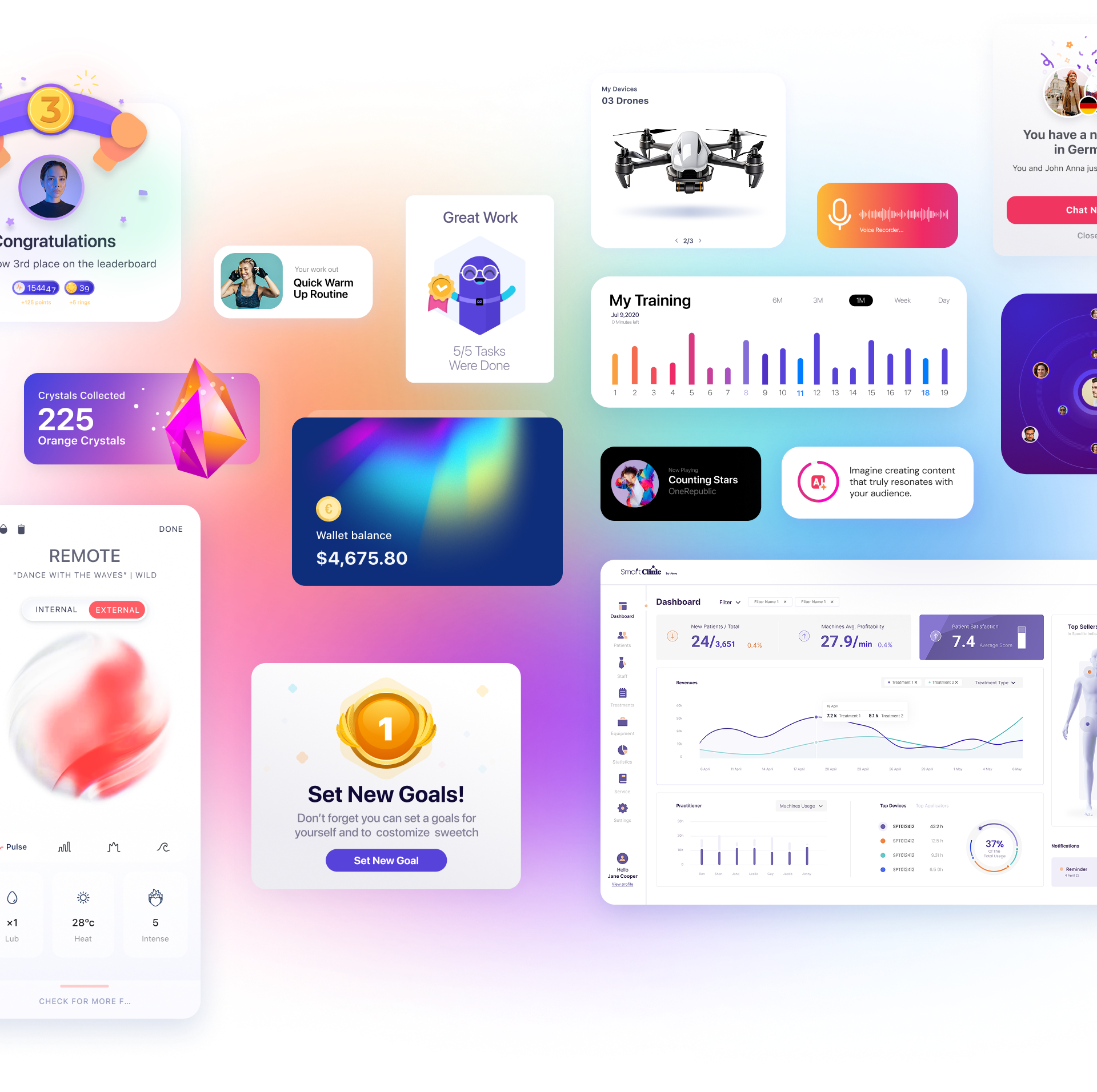
Animation in user interfaces has been an issue of hot debates for several years so far. It’s especially active in the domain of conceptual animation for user interfaces. It offers creative experiments and pushes the limits of UI motion.
One of the most critical steps in the user interface (UI) design process is selecting the right color palette. Colors have the power to communicate messages and evoke emotions, much like words do. Think about every time you’ve encountered a website, app, or digital product—the visual impression, heavily influenced by color, is what shapes the user’s first impression.
How Does Color Choice Impact UX/UI?
Reflects Brand Personality:
Color significantly affects the mood, perception, and overall identity of a brand or product.
Enhances User Experience:
A well-chosen color palette makes information easy to read and understand, guiding users intuitively through the interface and encouraging engagement.
Influences Purchase Decisions:
The visual appeal of a product is a key factor in users’ purchasing decisions.
Now that we’ve covered the importance and impact of color in UI design, here are 10 essential principles to focus on during the design process:
1. Color Terminology
Understanding color terminology is fundamental for building a unique and effective color palette. Here are some key concepts:
- Hue: The pure form of a color, without any tint or shade.
- Tint: Created by adding white to a hue.
- Shade: Created by adding black to a hue.
- Tone: Produced by adding both tint and shade to a hue.
- Value: Refers to the lightness or darkness of a color.
- Saturation: Indicates the intensity or vibrancy of a color.
2. Hierarchy
Color is a powerful tool for establishing visual hierarchy. When a design element stands out due to its color, it signals higher importance. Use varying shades and tones to represent different levels of emphasis and guide users’ attention to key elements.
3. Expressing the Design Language
Maintaining a consistent color palette strengthens your brand’s visual language. Colors are a cornerstone of brand identity, so it’s crucial to thoughtfully integrate brand colors throughout the interface.
4. Inclusive Design
UI design should be accessible to all users, much like public architecture. Following accessibility guidelines such as WCAG ensures your color choices are inclusive and usable for everyone. Tools like Stark can help you test and optimize color accessibility. While striving for unique and creative designs, always remember the end user and prioritize a seamless, intuitive experience.
5. Meaning
Colors evoke different feelings and emotions. Understanding color psychology allows you to align your palette with the emotions you want to trigger in your users. Know your target audience, and remember that color perception can vary across cultures and regions.
Brands often use color strategically in branding and marketing to influence customer emotions. For example, many fast-food chains use red and yellow because red stimulates appetite and excitement, while yellow conveys happiness and friendliness.
6. Limiting Color Usage
Neutral colors can be used to highlight and draw attention to specific elements such as text, images, or buttons. This approach helps users focus on the content rather than the interface itself. Apps like Instagram and Pinterest, which feature colorful user-generated content, often use clean and subtle UI designs to keep the focus on the content.
7. Indicating States in the UI
Color is an effective way to communicate changes in the state of UI elements, such as whether a button is clickable or disabled. For example, a muted button color indicates it’s inactive, while a red button signals an error or warning.
8. Consistency
Consistent use of color ensures that users receive the same message, regardless of context. If green is used to indicate success, it should always represent success throughout the interface.
9. Building a Color Palette
So, how do you create the perfect color palette?
Step 1: Choose the Primary Color
This is your brand color, selected based on market research, color psychology, and client preferences. Once chosen, select complementary colors for text, backgrounds, and other elements.
Step 2: Create the Palette
Use tools like Google Color Tool to generate various shades of your primary color. While these tools provide a solid starting point, refine the palette to best fit your brand and design needs.
Step 3: Apply the Palette to Your UI Design
Integrate your chosen colors consistently across the interface for a cohesive look and feel.
10. The 60-30-10 Rule
This classic rule from interior design applies perfectly to digital interfaces:
60% dominant color, 30% secondary color, and 10% accent color.
This ratio creates visual balance and helps designers avoid overusing any single color, resulting in a harmonious and engaging user experience.


