- Pitangoux is now Triolla –
We’ve rebranded! Hello and welcome!


 Book a Call


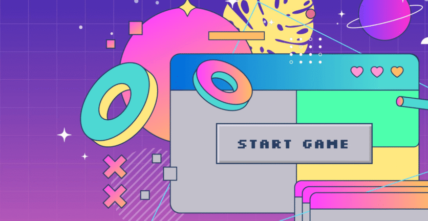
Designing a dashboard user interface is like creating a map for your application, helping the brain build a mental model of how the product works. Let’s explore the unique challenges of dashboard UI design and review some top tips for getting it right.
Rolling Up Your Sleeves: The Main Challenge in Dashboard UI Design
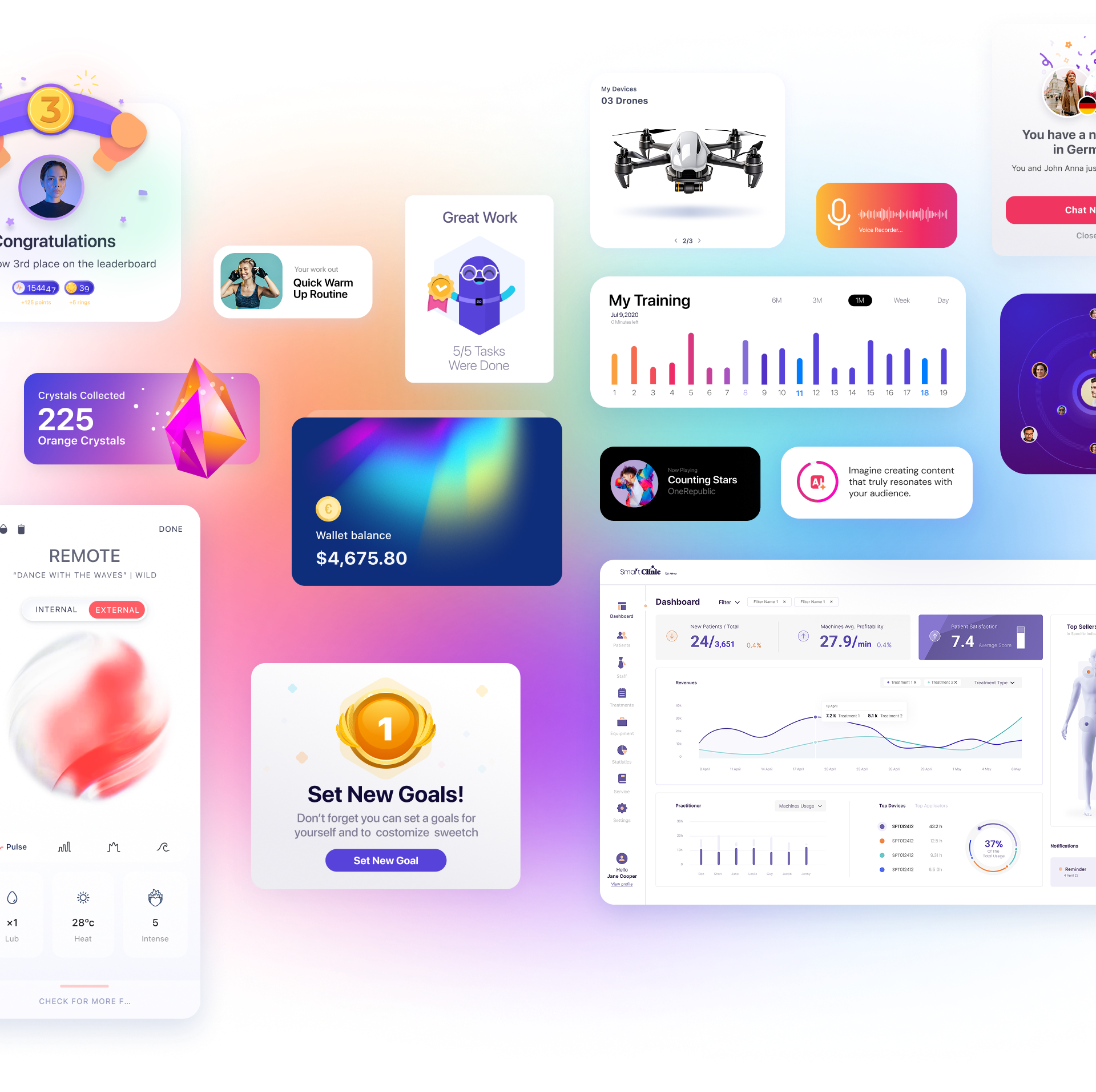
Dashboards tend to cram a lot of information into a minimal space. The result? A messy jumble that can easily overwhelm users with data. Most clients want to include as much information as possible in the dashboard, without realizing that due to the human brain’s limited capacity to process information, “more data” isn’t always better for the product or the organization.
Our working memory can only hold a certain amount of information, and once it’s full, we start to forget things. Except for people with phenomenal memory, the average working memory capacity is relatively low—studies show it’s about 7-9 items that can be remembered simultaneously. The amount of information the UI requires users to remember is called “cognitive load.” In this context, the goal of UI design is to reduce cognitive load and free up the brain to focus on the task at hand, rather than wasting energy trying to figure out how the interface works.
So, the main goal when designing a dashboard UI is to strike the optimal balance between the most useful information and a low cognitive load. But how do you determine the optimal amount of information?
Here are 3 excellent tips for effective dashboard UI design:
Information Hierarchy
One of the simplest ways to identify elements in our environment is by their relative size within a context. You can leverage this in dashboard UI design to guide users’ eyes to the most essential elements, creating a clear hierarchy.
As Patrick Lencioni said, “If everything is important, nothing is important.” That’s exactly the point: a hierarchical arrangement helps users navigate the page faster and focus on a few top-priority options. Once they find the relevant information, they can dive deeper into the appropriate category.
White Space
Humans process information through contrast, or by using our evolutionary ability to make sense of our environment by distinguishing shapes from their background. Our eyes like to explore the entire page in front of them. White space, on the other hand, signals “nothing to see here” and directs the eyes elsewhere, like guardrails on a road. White space creates contrast around page elements and defines them in a way that makes them easier to see.
This is especially important in dashboard design, as it helps users quickly find what they need to focus on and identify different elements on the page.
Less is More
It sounds better in English, but the principle is universal: aim for the bare minimum, or as little information as needed to get the message across. Often, this is much less than we think, which is why it’s so important to test your dashboard UI design with real users.
Users are smart and learn quickly—there’s no need to label every button and chart with words. In fact, words are the hardest thing for users to process in an interface—use them sparingly!
Consider using icons, colors, and micro-interactions to convey functionality instead of descriptions and labels. These are much easier for the brain to process than words, and they’ll also save you a lot of space on the page.
A Few Final Thoughts
These rules work beautifully together. For example, by carefully prioritizing the elements you choose to display, you’ll build an information hierarchy. By grouping related concepts within the same white space, you’ll create “chunks” of information or clusters of relevant ideas, making them easier to process (think of categories in restaurant menus).
If you follow the three recommendations described in this article, you’ll see a dramatic improvement in your dashboard UI design. Those who have done this for years know that, in the end, it simply works.