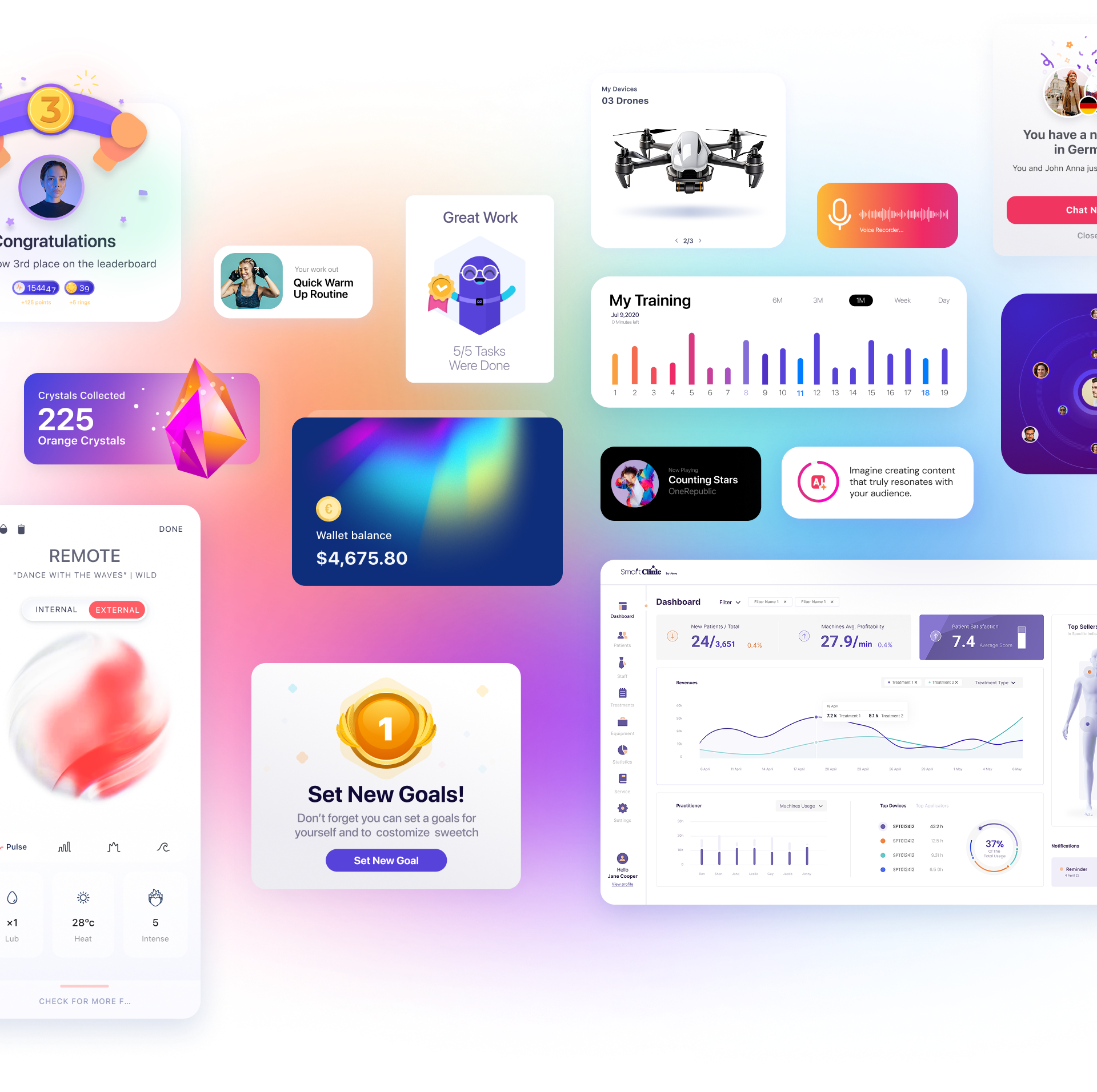
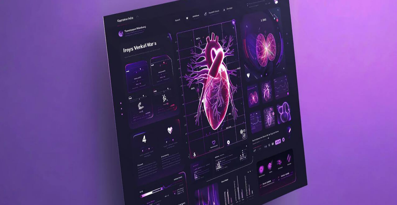
We interact with them consistently. From morning check-ins to end-of-day reports, dashboards have become the unsung heroes in our professional lives, especially as the world leans into a hybrid working model post-pandemic. At Triolla, as leading UX designers serving Israeli startups and corporates, we believe in the potential of an expertly-crafted dashboard UI. Let’s delve into the art and science of creating an impeccable dashboard UI and understand how top brands nail it.
The Intriguing Origins of Dashboard UI
Ever pondered over the origins of the term ‘dashboard’? It harks back to the world of aviation and space. Pilots and astronauts rely on a control system, a ‘dashboard’ if you will, to navigate. But in a twist of nomenclature, it was the automotive sector that popularized the term. Traditionally, a dashboard referred to the panel indicating vital stats like speed, fuel, and temperature.
With the digital age in full swing by the early 2000s, the concept of a “Dashboard UI” emerged. In the world of UX UI portfolios, it represents a digital interface showcasing real-time Key Performance Indicators (KPIs). This is where decision-makers can gauge the pulse of their organization, thanks to this visually compelling data representation.
Mobile devices, novel design choices, and advanced data visualization like heat maps have since ushered in an era where dashboard UIs are more sophisticated and user-friendly.
Dashboard UI: More Than Just a Pretty Interface
Goal-Oriented Design is King
Despite evolving designs and trends, the core objective of dashboard UI design remains unaltered:
-
Offer users a concise and clear snapshot of vital business metrics.
-
Empower users with the data they need to make informed decisions efficiently.
By adhering to design conventions and best practices, designers at our UX studio and worldwide can craft dashboards that merge functionality with creativity. Think of it as an empowering tool steering your business towards its objectives.
The Ubiquity of Modern Dashboard Designs
You might’ve noticed a striking similarity among modern dashboards, as if they’ve all been molded from the same UX UI portfolio blueprint. Why is that?
-
Adherence to Standardization and Best Practices
Over the years, certain non-negotiable standards have been established for dashboard UIs. From lucid navigation and labeling to relevant data visualizations, designers leaning into these guidelines can inadvertently result in similar-looking UIs. -
Meeting User Expectations
With users now expecting specific features from their dashboards—like data drill-downs, custom views, and data filtering—designers work to integrate these elements. This user-centric design approach can sometimes result in UIs bearing a family resemblance. -
The Challenge of Design Constraints
Presenting vast data amounts in a confined space is no easy feat. This often compels designers to embrace a minimalist design to aptly accommodate the data, which can again lead to similar UI aesthetics. -
Usability Trumps All
At the heart of an effective dashboard UI is its ability to make data comprehension a breeze. Hence, designers often prioritize user-friendly features over aesthetic elements, leading to certain UI similarities.
However, it’s the nuanced touches that can set your dashboard UI apart. While the foundational structure might be standard, the play of branding elements, innovative typography, and colors can infuse uniqueness into your dashboard.
At Triolla, our expert UX designers prioritize crafting bespoke dashboard UIs that don’t just fit the mold but break it. After all, in a sea of similarities, it’s the unique touches that make a world of difference.


 Book a Call


